
Assorted Logomarks for the Superior Court of California, County of Los Angeles.
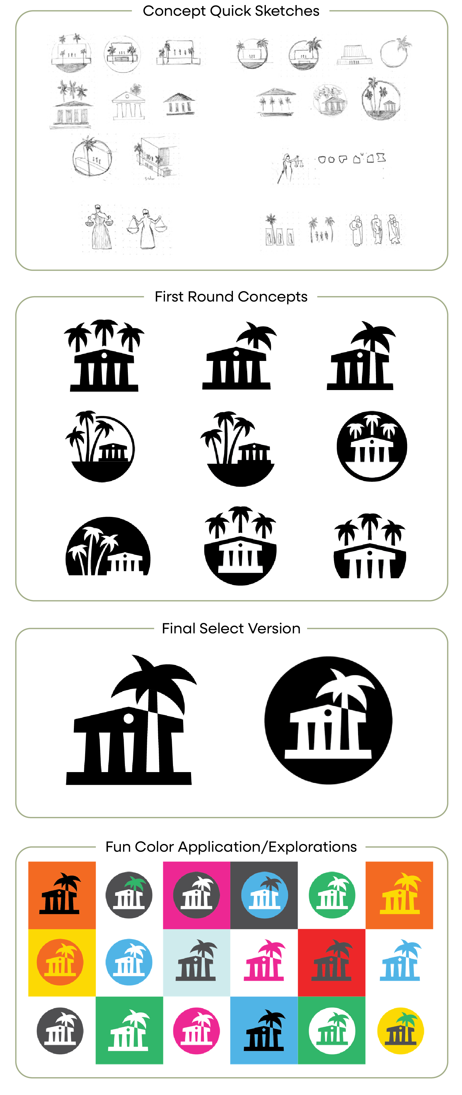
Court Commons Logomark - June, 2025
I was given the opportunity to craft a logo for a new Court-wide public outreach program. It was on a tight timeline as the program was nearing launch and it was decided that it warranted its own logo. The creative brief was short and sweet.
“The logo needs to be modern, easily identifiable, and incorporates LA Court imagery.”
…and we need it in about two weeks…
I broke out the dusty sketchbook and worked through several ideas/concepts. Some felt right and were explored more, some were abandoned along the way. Given the timing, I presented a small group of these sketch concepts in order to jump-start the selection process, and we quickly moved from these doodles to final artwork options. These final options were presented to the leadership team who selected what in my opinion was the '“best” version (that doesn’t always happen.)
As part of the presentation, I worked up a fun color exploration using colors from the program. It’s nice to work with big bright colors sometimes!
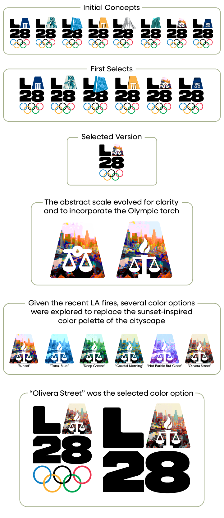
LA28 - Court Logomark for 2028 Olympics - May, 2025
As part of preparation for the Olympics there is a county-wide LA28 campaign in progress where companies, agencies, organizations and brands have their own version of the LA28 Olympic logomark. I was given the opportunity to develop a mark for the Court’s future communications as they relate to the Olympics.
I explored a number of concepts and pursued a relatively wide range of concepts within the limited “A”vailable space. Options were presented and selected. That version was then taken through several iterations arriving at a version that combines the Olympic torch and scales of justice. Then color palettes were explored to replace the sunset theme–which could be interpreted as fire–with several options. I look forward to seeing it live in the public space in the future.
Judicial Leadership Academy - April, 2025
The Court offers an exclusive program to Judicial Officers who are interested in furthering their own leadership qualities. This program team requested a logo specific for their needs. At the outset we discussed concepts and so began with a relatively clear vision for what this logo should be. Two concepts came out as the favorites and variations were explored along the way.
You’ll see in this story that the first concepts are presented in black and white. I intentionally restrain color from the early creative reviews as it has such a strong subjective pull. Once we have logo concepts coming together, color is discussed and explored. This helps the process stay on track and positions those subjective conversations at an appropriate time in the process.
